Soziale Stadt ProPotsdam gGmbH
To help local residents identify with the Kirchbergtreff, the mood of the neighbourhood served as a source of inspiration when developing the corporate design. The photo of a sunset on the horizon of the Weißer See lake near the Kirchbergtreff formed the basis for the colour palette.
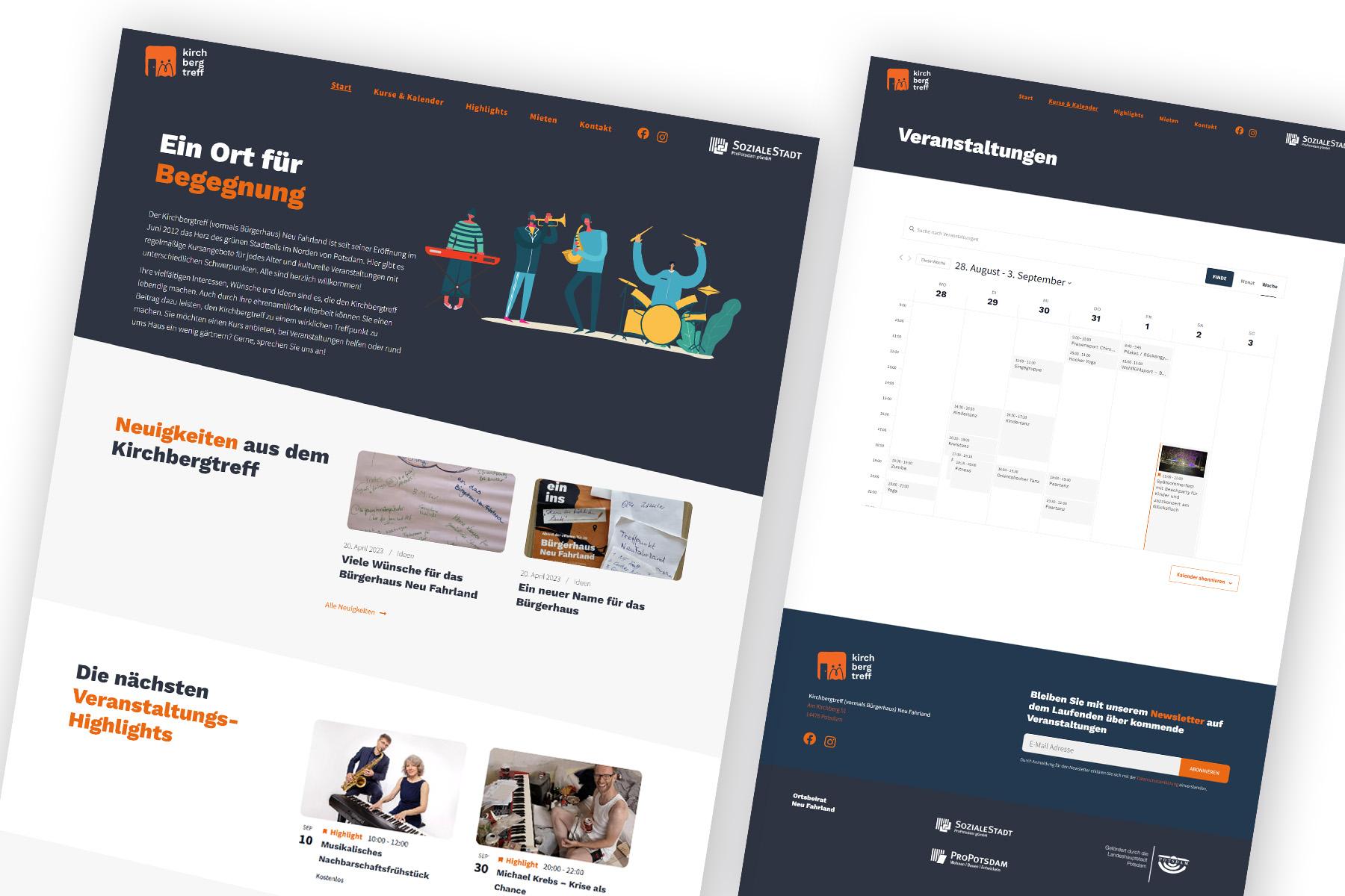
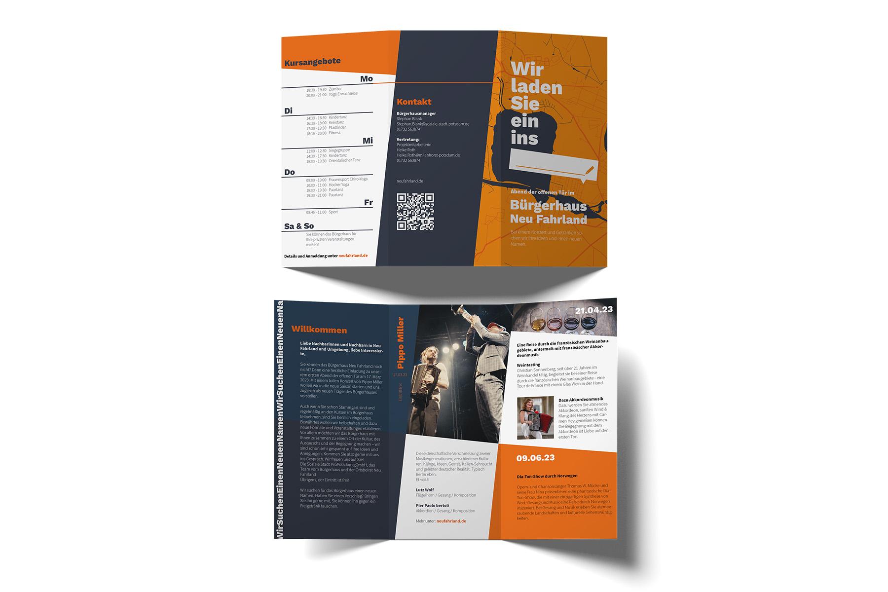
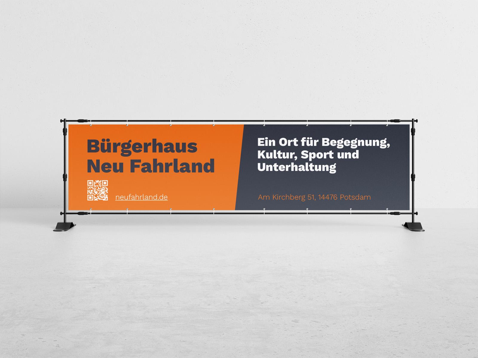
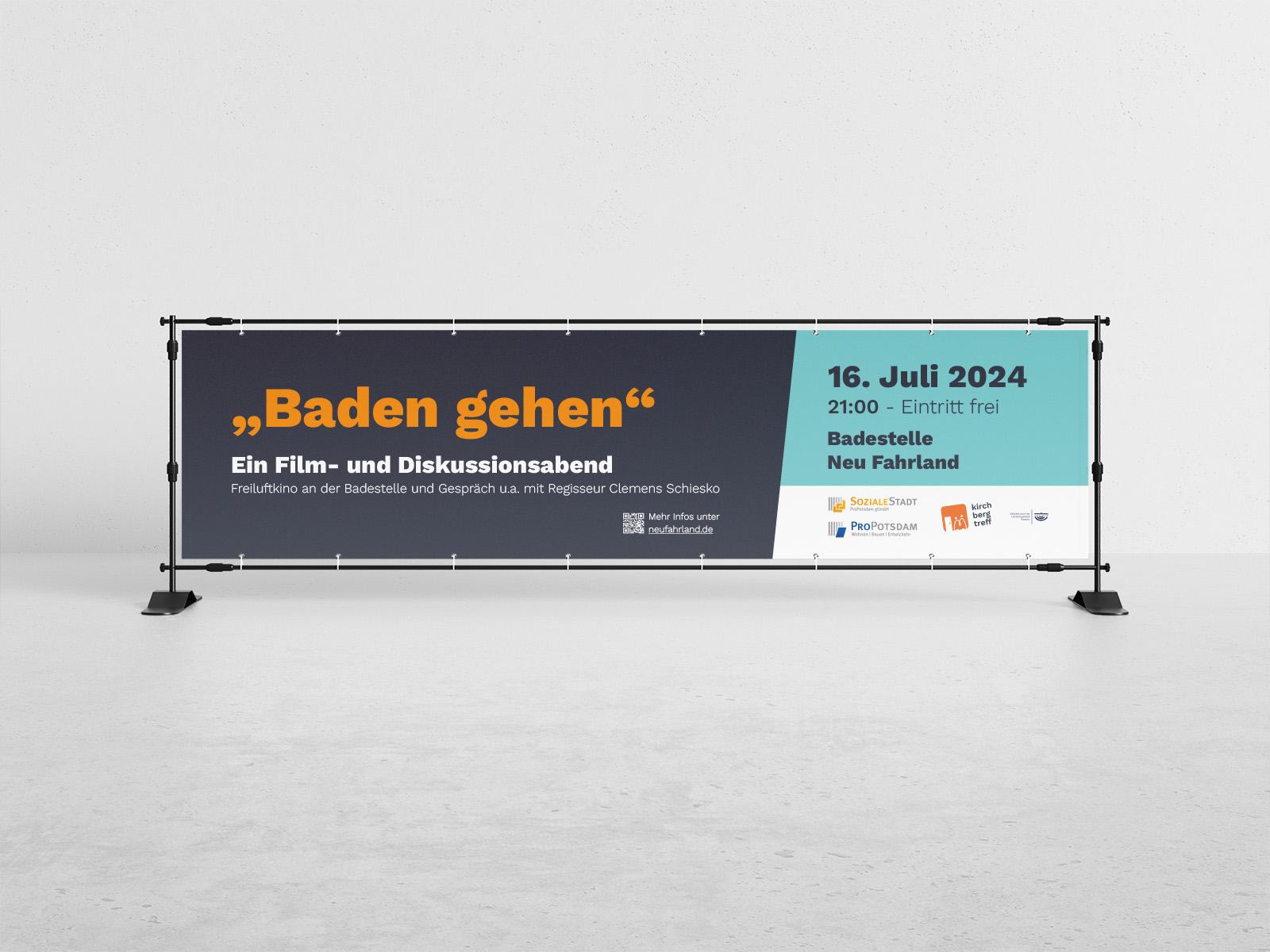
With the aim of matching the design to the diversity of the community centre’s offerings, playful design elements were harmoniously combined with a clear structure to appeal to people of all ages. Accessibility was a key objective, which was particularly taken into account in the typography and design of the website. Based on the logo and corporate design, various printed materials, templates and a website were developed with a consistent look and feel.